You’ve spent hours in the basement or bedroom, hunting for the perfect kick drum sample, layering that hi-hat like your life depends on it, and finally nailing a transition that would make Frankie Knuckles nod in approval. You’ve got the mixes. You’ve got the vibe. But when a booker opens your press kit, what are they going to remember first? If you said your bio or your tracklist, you’re about three steps behind the curve. The real first impression—the thing that sticks in a promoter’s brain after they close the PDF—is your artist logo. And not just any logo. An artist logo vector black white setup is the sleek, timeless, and utterly professional move that separates a press kit that lands the gig from one that gets deleted in under five seconds.
Think about it. Every legendary DJ who built a lasting brand—from Larry Levan’s Paradise Garage posters to the clean minimalism of modern techno icons—understood that black and white is the language of authority. Color is great for Instagram stories, sure. But when a club owner in Berlin or a festival curator in Asia is scanning a hundred press kits at 2 AM, the high-contrast immediacy of a black and white vector logo cuts through the noise. It says, “I’m here to work, and I know what my visual identity is.” It’s not a distraction. It’s a signature.
So why vector? Because vector files—think .ai, .eps, or .svg—are infinite resolution. That logo needs to look crisp on a phone screen, sharp on a printed flyer outside Berghain, and massive on a banner at Tomorrowland. A raster image, like a .jpg or .png, gets pixelated and fuzzy when you scale it up. That screams amateur. A vector file scales to the size of a billboard without losing a single line. That screams “I’ve got my logistics together.” And in a press kit, where every detail screams either “book me” or “skip me,” the vector spec is non-negotiable.
Now, back to black and white. Pop some neon color into your logo, and suddenly you’re fighting with your own album art, your promo photo, and the vibe of the venue’s lighting system. Black and white is neutral without being boring. It works on any background—dark, light, textured, digital, physical. It’s the equivalent of a perfect DJ set that works at a sunrise beach party and a midnight warehouse rave. Versatility is the name of the game. Your logo should be the anchor of your press kit, not a distraction that makes the promoter question your taste.
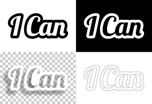
Practical tips for building this into your press kit? First, nix any idea of putting a complex, multicolored, gradient-heavy design at the top of your one-sheet. Instead, start with a clean, bold, black and white vector logo at the header. Below that, your name or DJ alias in a complementary sans-serif font. Then, maybe a simple icon that evokes your sound—a record, a waveform, a cube, a geometric shape. Keep it minimal. Keep it high-contrast. This isn’t a fashion editorial; it’s a professional dossier. The visual hierarchy should be: logo, name, then the essentials (genres, notable venues, a link to your best mix).
Also, consider the psychology. Black and white imagery feels more permanent. More archival. It connects you to the heritage of house and techno—think of the stark black-and-white photography of early Chicago and New York club scenes, the raw grit of the Paradise Garage posters. It’s a subconscious nod to the trailblazers like Wendy Hunt and Frankie Knuckles who built this culture without relying on flashy branding. It says you respect the roots while you push forward.
Don’t sleep on file naming, either. When you upload your logo vector black white files to your press kit folder, name them intelligently. “LogoBW_Vector_DJYourName.ai” is gold. So is having a white-on-black version and a black-on-white version. Some clubs print on dark paper. Some on white. Have both ready. It’s small-brained genius.
Finally, test it. Pull up your press kit on a cheap phone screen. Zoom in. Zoom out. Print it on a laser printer. If the logo looks like a blurry mess, go back to the vector. If the white bleeds into the page, adjust the stroke weight. The goal is that a promoter, scrolling through your kit, does not need to squint or think. They see your logo, they know your name, and they instinctively associate it with quality and forward motion.
Building your DJ brand is not just about the mix. It’s about the package around the mix. And a killer artist logo vector black white is the anchor that keeps your press kit from flopping. Go make yours.